The New York Times
Storytelling
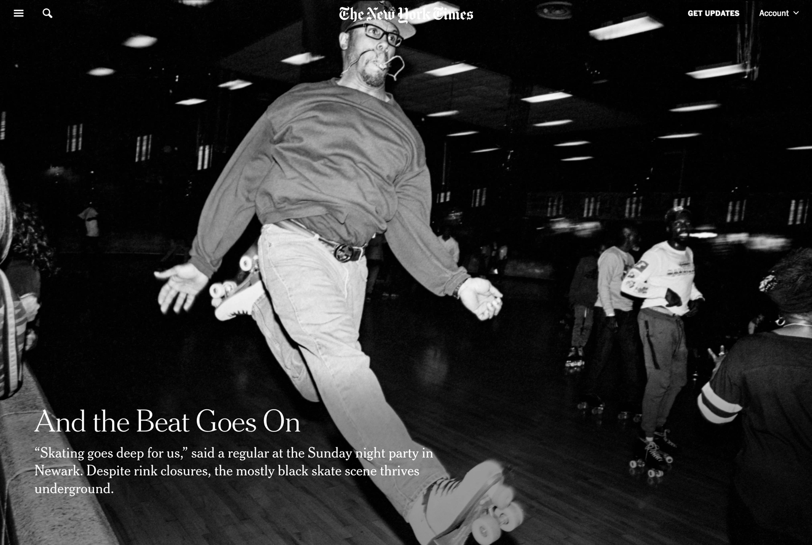
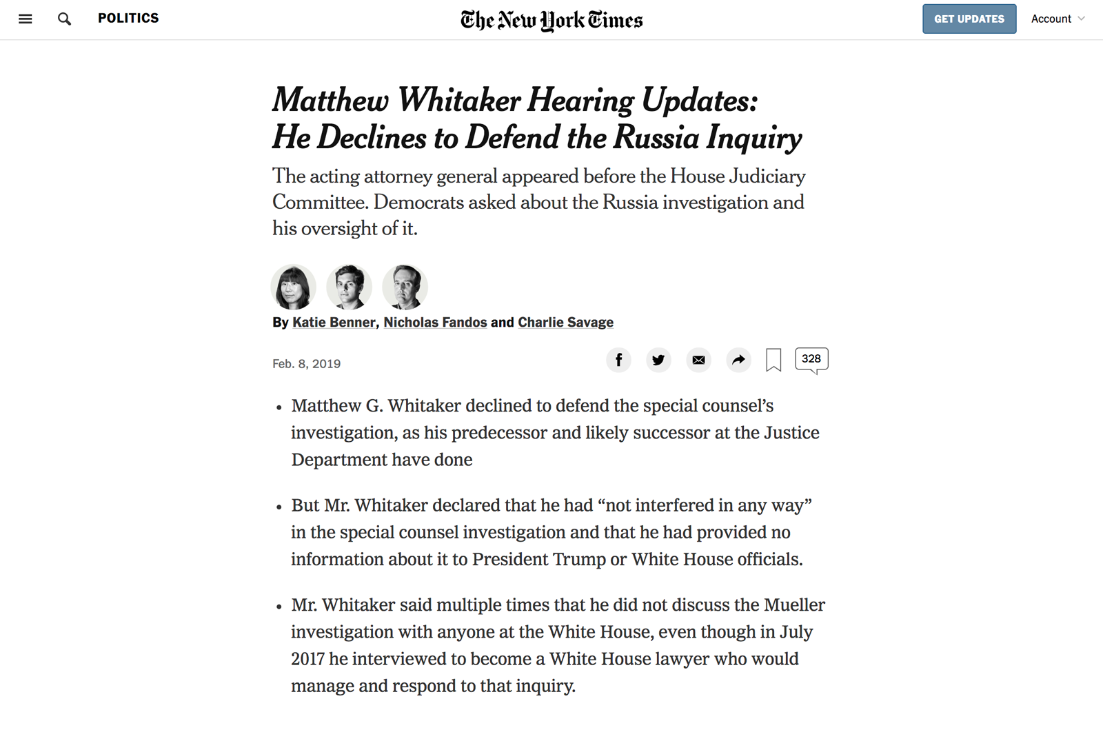
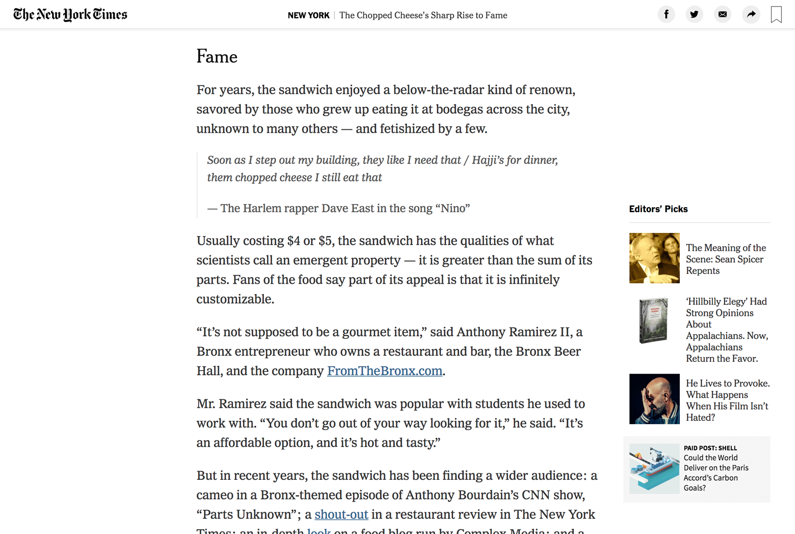
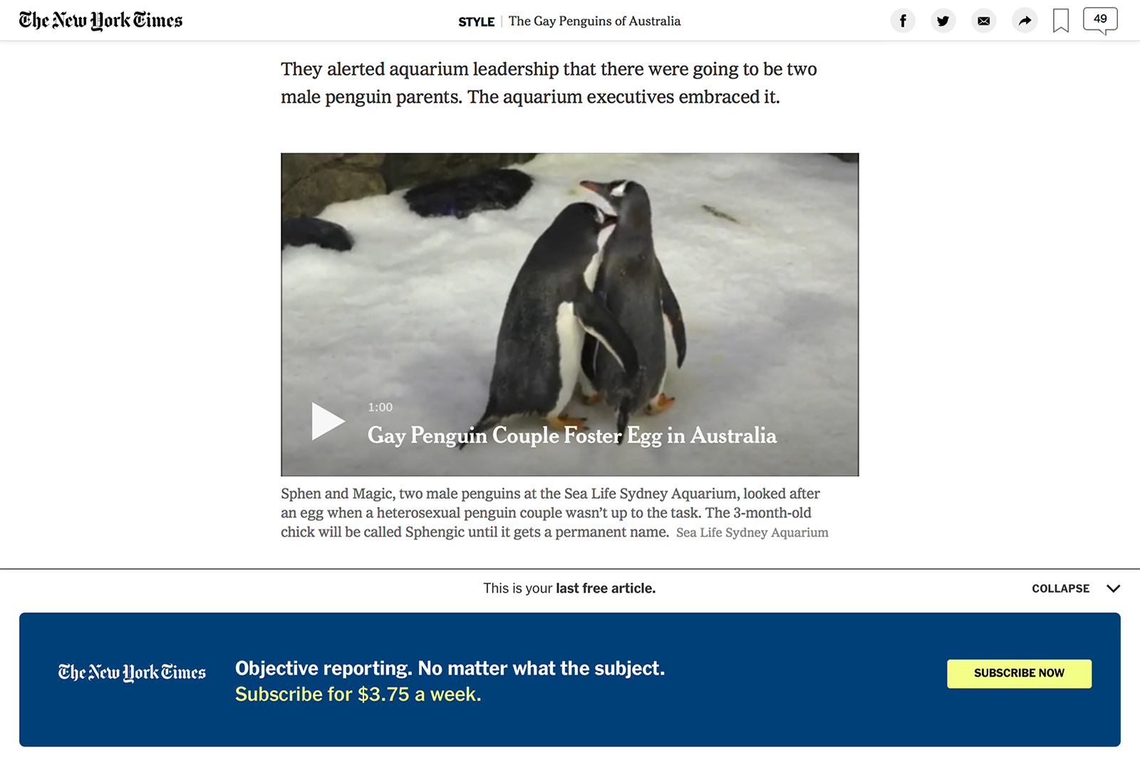
The majority of my three and a half years spent at the Times has been as a member of the Story team. This team is responsible for the layout system that generates the majority of our articles produced daily by the large staff of journalists and editors. The system allows for a wide range of flexibility while supporting a complex set of business rules across multiple platforms.
Fully redesigned to coincide with the launch of a new WYSIWYG-like CMS, the latest story system is a complete rethink of how articles on the web are presented. New ad formats that span the entire width of the page required us to create a streamlined article—one that relies on the stacking of elements rather than the more desktop-oriented design of old that relied on a number of floated elements. I was the lead designer for this new system, integrating a new typographic system while removing many of the legacy designs that had led to bloat and complexity.
Here are a couple great examples of the system:
- The Kings of the Dollar Slice Build a Better Pizza
- ‘It Is Not a Closet. It Is a Cage.’ Gay Catholic Priests Speak Out
- Visiting Puerto Rico, and Finding the Up Beat
- Matthew Whitaker Hearing Updates: He Declines to Defend the Russia Inquiry
As a part of the redesign we ran a design and research sprint that included a lengthy user research component. We interviewed readers across the country (and abroad) to understand their behaviors and needs in a changing news ecosystem. We generated a series of design provocations at various fidelities to allow readers to question even the most basic of reading experiences.
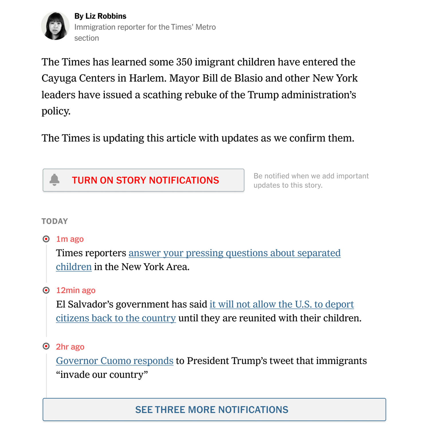
This research has continued with numerous design sprints and research projects exploring specifics such as breaking news, linking to related articles, and exploring how users differentiate news and opinion coverage. I have led brainstorms and research sessions to facilitate the development of design thinking processses throughout the Times product organization. I also maintain our team’s design documentation, which ranges from technical explanations of our component design to a set of user principles that help cross-functional teams quickly understand the needs and behaviors or our article readers.
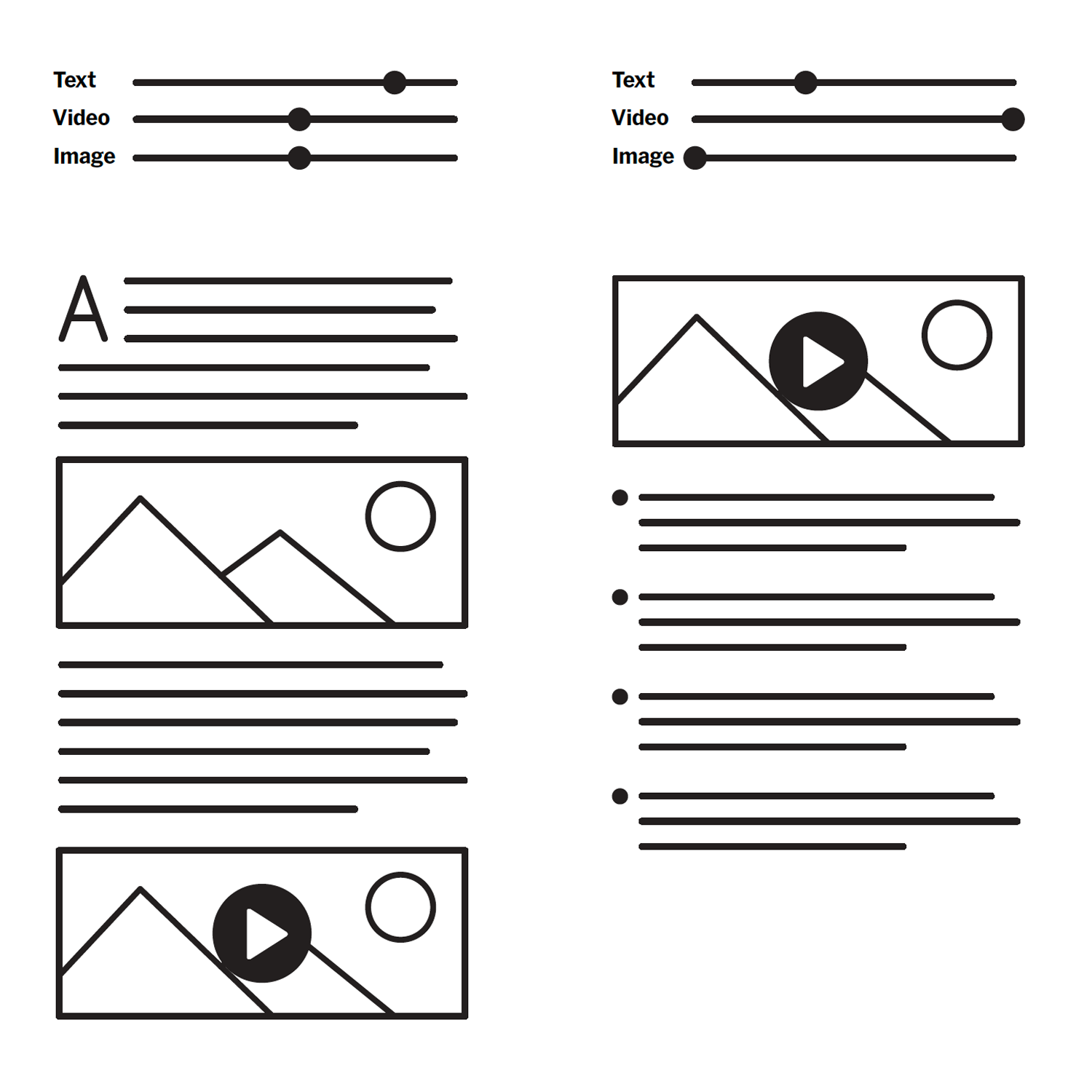
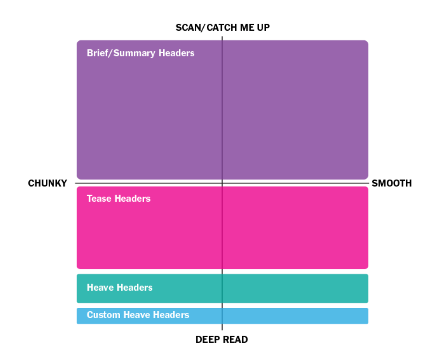
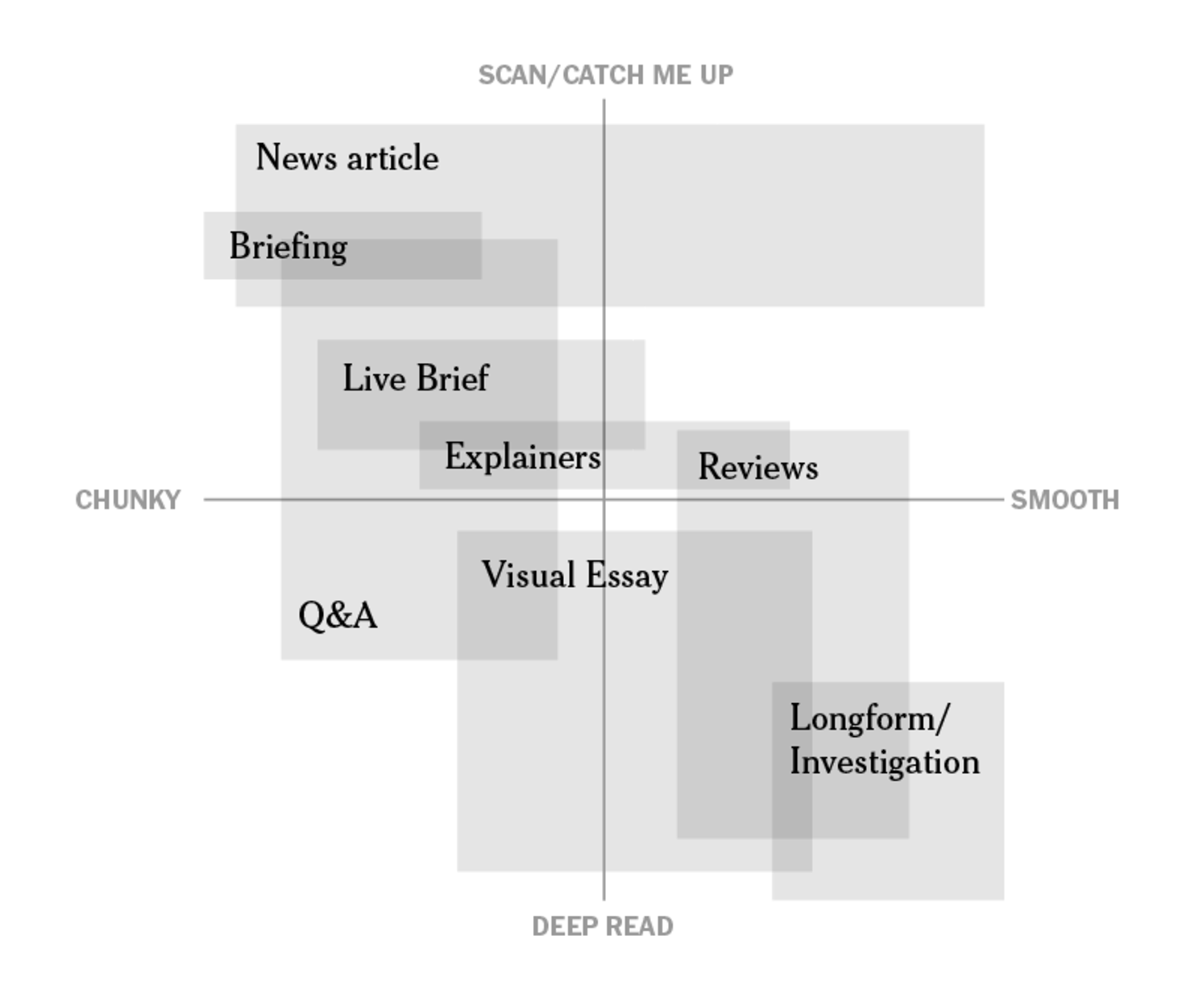
I often design graphics and other visualizations of our product strategy in an effort to help various teams align on priorities and agree to larger product principles in ways that a text document or deck cannot. While these visualizations rarely leave our presentation decks, they have become a valuable tool for the product design team in many situations.
Additonal Product Team Work
In addition to my role on the Story team I have worked with a variety of other teams at the Times. I helped restructure our email templating system (including prototyping a new responsive structure and enhanced multimedia options). I have collaborated with cross-functional design teams multiple times to explore new products and technical systems. I consider the reader’s experience and the editorial workflow and tools needed to quickly produce content in a fast-breaking news environment. I often produce working interactive prototypes and animations to make the work readily understandable to executives and newsroom collaborators.
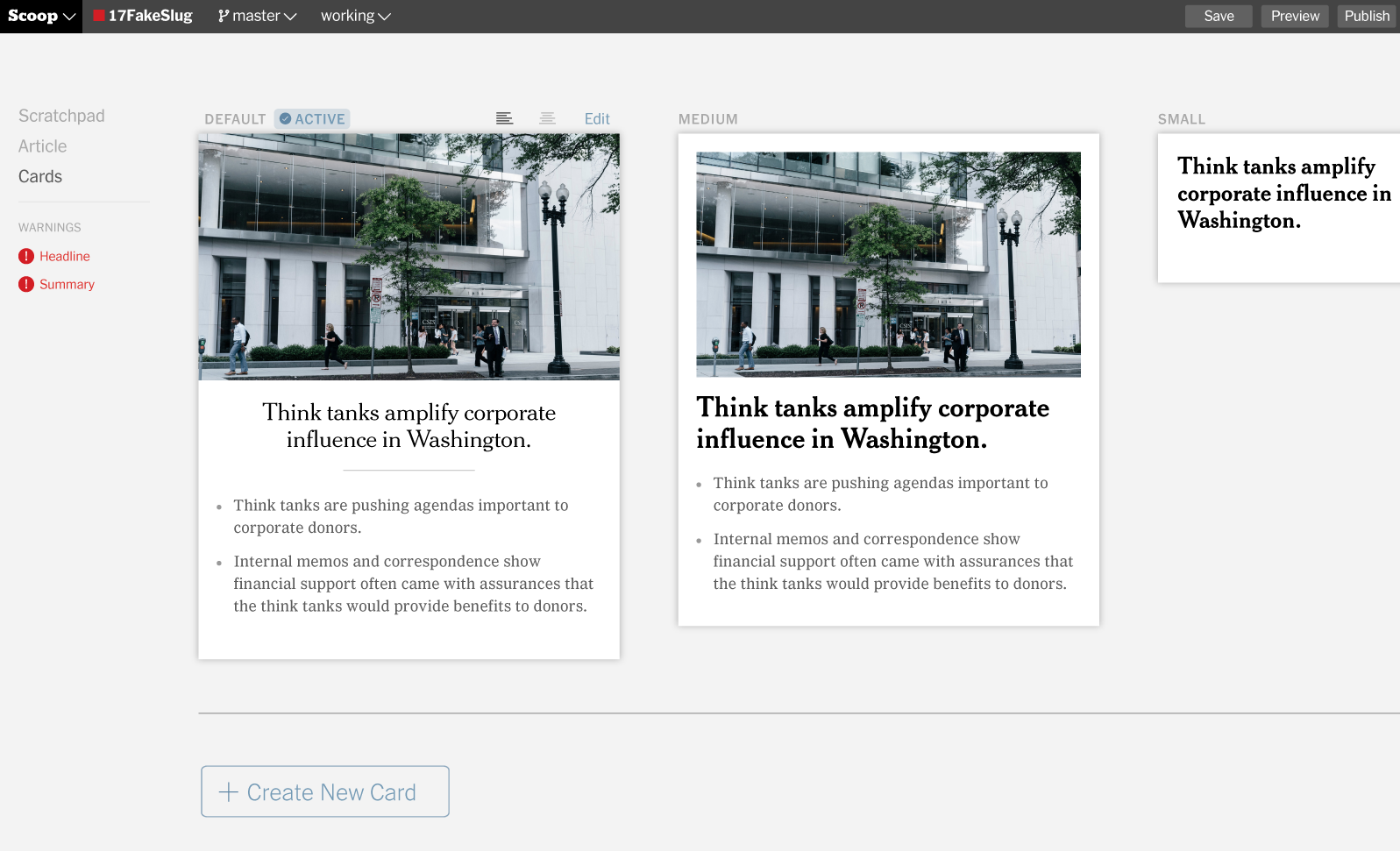
While crediting everyone involved in projects of this size is incredibly difficult, I’d like to acknowledge the members of the Story team over the past couple of years: design team lead Peter Rentz; designers Jasmine Wiggins, Javeria Ali, and Fernando Dias De Souza; product managers Lauren Chinn, Priya Ollapally Wellington, Frannie Hannan, and Nadav Gavrielov.